


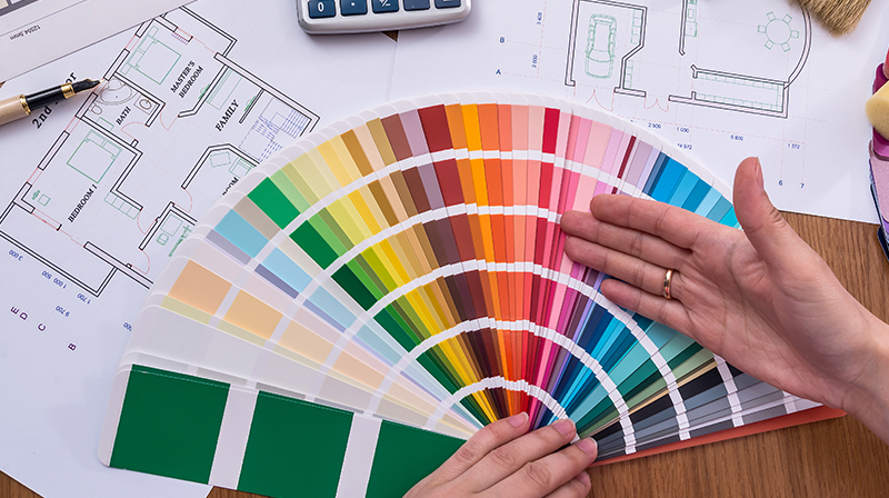
Color is one of the most important aspects of a room. Some colors make you feel warm and fuzzy; other colors make the room seem cold and intimidating. When designing spaces, color should be a priority so you can find the right fit for your room. If you’re amid the color picking process, look no further: Designing Spaces has a foolproof process of finding the right balance for any set of colors for any room.
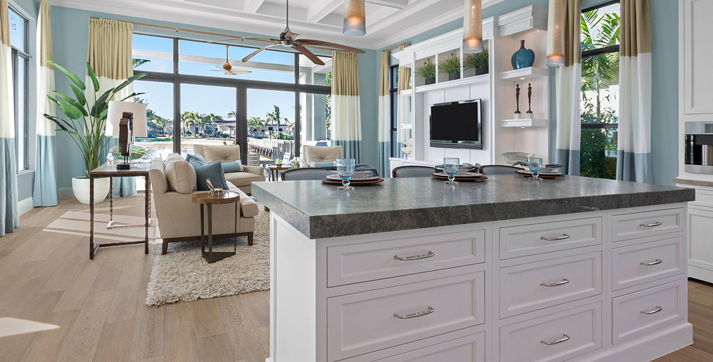
The first rule designers learn about color is the 60-30-10 rule. This is the most appealing way to the eye when assembling colors. 60% of the room should be the dominant color; this is typically the color of the walls. Next, the secondary color should be 30% of the room, like upholstery such as curtains and rugs. Finally, with this rule, the last 10% of the room is an accent color. Accent colors can be used in décor like art, throw pillows, or even bouquets of flowers.
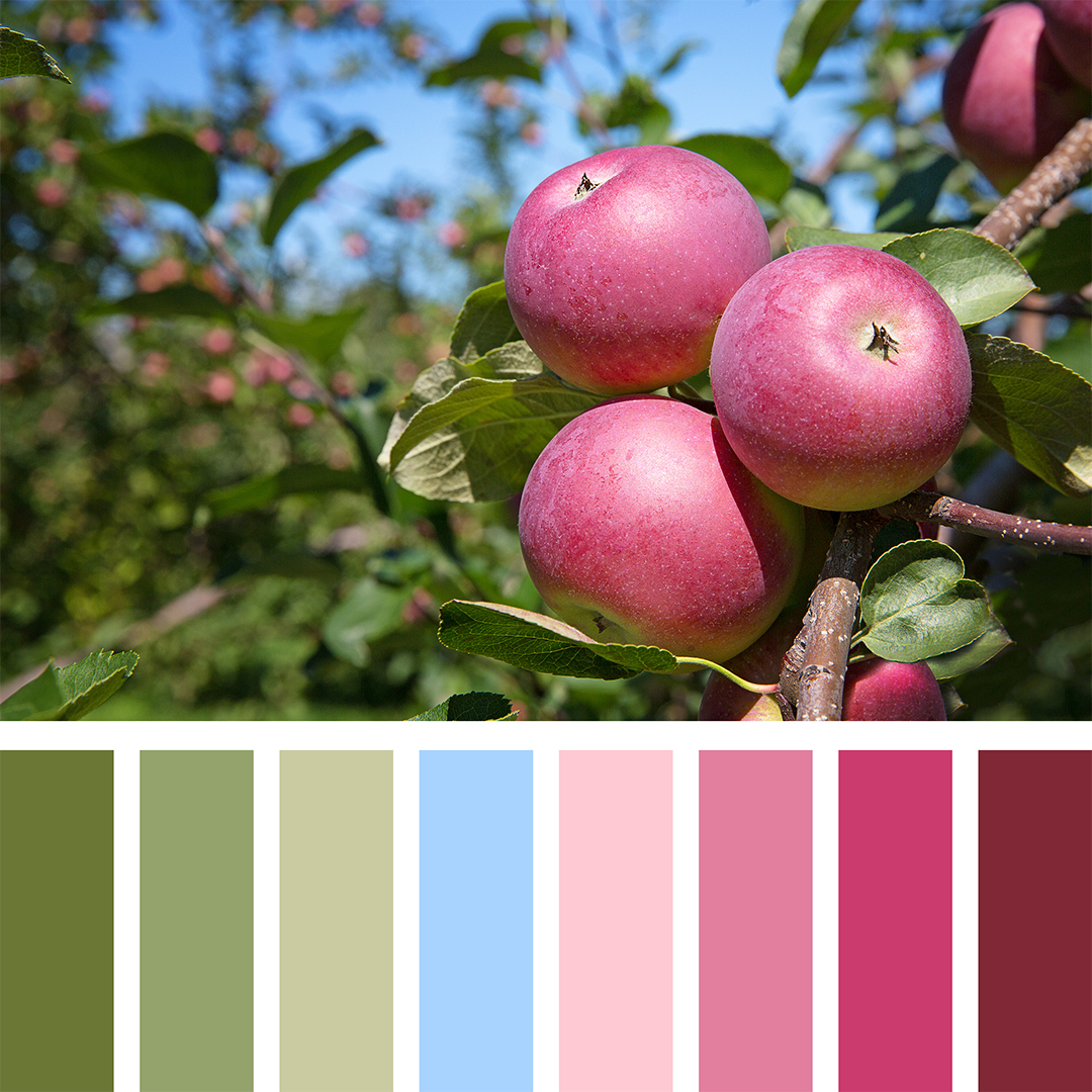
An easy way to go about the 60-30-10 rule is by taking the value of colors into consideration. Value is the relative lightness or darkness of a color. For example, plum has a darker value than lilac; baby blue has a lighter value than navy blue. To apply value to a space, move vertically. Choose heavier colors for the flooring and furniture, medium colors for walls, pillows, lamps, etc., and the lighters colors for wall décor, ceiling, fans, and crown molding. Accent colors should be in the middle section to bring attention to the bulk of the room. Don’t make the rug one of the three hot pink items in the room.
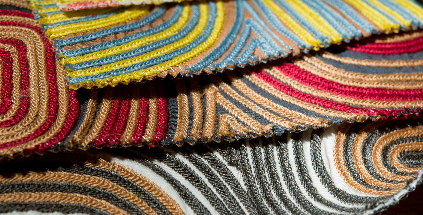
Understanding how to balance different colors is a lot easier once you have decided which colors you will use. Instead of throwing some swatches of your favorite colors on the wall to see what sticks, choose the patterns for your bedding, curtains, or furniture first and pull colors from those pieces. Finding patterns that match a wall exactly is a lot harder than painting the wall to match the pattern.
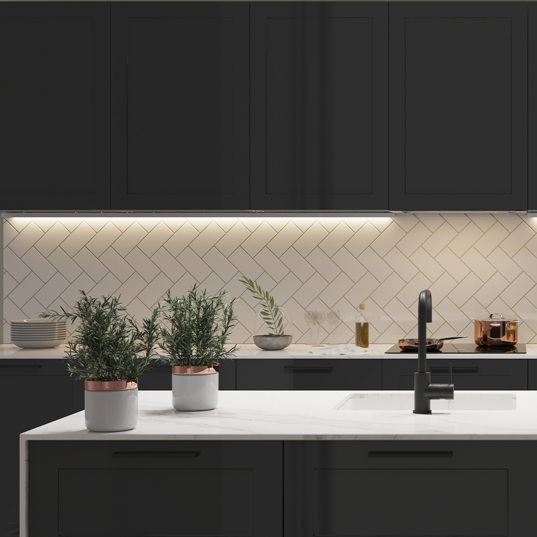
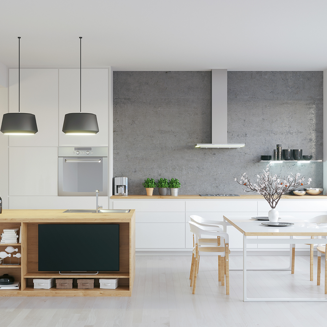
Use color schemes to create a more cohesive look. There are two types of color schemes: complementary and analogous. Complementary color schemes include colors that are across from each other on the color wheel like yellow and purple or blue and orange. Complementary color schemes are good for formal spaces like living rooms, dining rooms, and offices. Analogous color schemes are color schemes that have colors that are next to each other on the color wheel, like green and yellow. These create softer, warmer looks that are good for casual rooms like family rooms or bedrooms.


If you are working in a home and want to create one look for all the rooms, use one color in each room. In one room, use the color as the dominant color, in the next room the secondary, and in another the accent. For example, use a neutral gray in a bedroom for the walls, in the dining room for furniture, and in the living room for carpeting or rugs. This makes it easier to use different variations of the same color scheme throughout your home for a cohesive design that flows through every room of your house.
Always remember when choosing hues: colors are not just about looks; they’re about feelings. Consider how you plan on using the room and how you want others to feel in it. When designing spaces, mood will always trump matching colors.